Hey design fam! Ellen here, and today we’re diving into a topic that’s near and dear to my heart: typography. If you think typography is just about picking a pretty font, buckle up – we’re about to embark on a journey that’ll transform how you view text in design.
Why Typography Matters
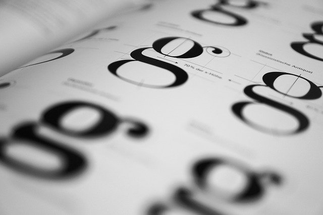
First things first: typography isn’t just about making words look good (though that’s definitely part of it). It’s about communication. The right typography can convey mood, direct attention, and even influence how people perceive your message. In both graphic and web design, typography is your silent spokesperson, setting the tone before a single word is read.
Font Pairing: The Art of Typographic Harmony
One of the most common questions I get is, “Ellen, how do I choose fonts that work well together?” Well, my friends, welcome to the art of font pairing. Here are some quick tips:
- Contrast is Key: Pair a serif font with a sans-serif for a classic, balanced look.
- Stay in the Family: When in doubt, use different weights within the same font family.
- Mood Matching: Ensure both fonts convey a similar mood or feeling.
- Don’t Overdo It: Stick to 2-3 fonts max in a single design.
Remember, the goal is to create harmony, not a typeface cacophony. Your fonts should complement each other, not compete for attention.
Hierarchy: Guiding the Eye
Typography isn’t just about what fonts you use, but how you use them. This is where hierarchy comes in. Typographic hierarchy is all about organizing your content so that the most important elements stand out and users can easily scan your design.
Here’s a basic hierarchical structure:
- Headline: Large, bold, attention-grabbing
- Subheading: Smaller than the headline, but still prominent
- Body Text: Your main content, easily readable
- Caption/Footer: Smallest, used for additional info
By varying size, weight, color, and spacing, you create a clear path for the eye to follow. This is crucial in both print and digital designs – nobody likes to be lost in a sea of uniform text!
Readability: Making Your Words Work
Now, let’s talk about readability. You could have the most beautiful typography in the world, but if people can’t read it easily, you’ve missed the mark. Here are some factors that affect readability:
- Font Size: Aim for 16px minimum for body text on web designs.
- Line Height: Generally, set it to 1.5 times your font size for comfortable reading.
- Line Length: Keep lines to 50-75 characters for optimal readability.
- Contrast: Ensure enough contrast between your text and background.
- Spacing: Give your letters, words, and paragraphs room to breathe.
Remember, what looks good on your giant designer monitor might be a squint-fest on mobile. Always test your typography across devices!
Typography and User Experience
In the world of UX design, typography plays a crucial role. It’s not just about aesthetics – it’s about usability. Good typography can:
- Improve Navigation: Clear, hierarchical type helps users find what they need.
- Enhance Scannability: Well-structured text allows users to quickly grasp key information.
- Build Brand Identity: Consistent typography across platforms strengthens brand recognition.
- Affect Mood: The right typeface can set the emotional tone for your user’s experience.
Remember, in UX design, your goal is to make the user’s journey as smooth as possible. Typography is your roadmap.
Common Typography Mistakes to Avoid
Before we wrap up, let’s quickly touch on some typography faux pas I see all too often:
- Overusing Decorative Fonts: Save them for headlines or special occasions.
- Neglecting Kerning and Tracking: Pay attention to letter spacing, especially in logos.
- Poor Contrast: Light gray text on a white background? Please, no.
- Ignoring Mobile: Always check how your type looks on smaller screens.
- Overcrowding: Give your text some breathing room!
The Journey Continues
Typography is a vast field, and we’ve only scratched the surface here. As you continue your design journey, you’ll develop an eye for what works and what doesn’t. Trust that instinct, but always be open to learning more.
Remember, great typography isn’t about following strict rules – it’s about understanding the principles and then bending them creatively to serve your design’s purpose. It’s a delicate balance of science and art, function and form.
So, next time you’re working on a design, give a little extra love to your type. Your words have a voice – make sure it’s saying exactly what you want it to say, in exactly the way you want to say it.
Until next time, keep those serifs sharp and your x-heights high!