-
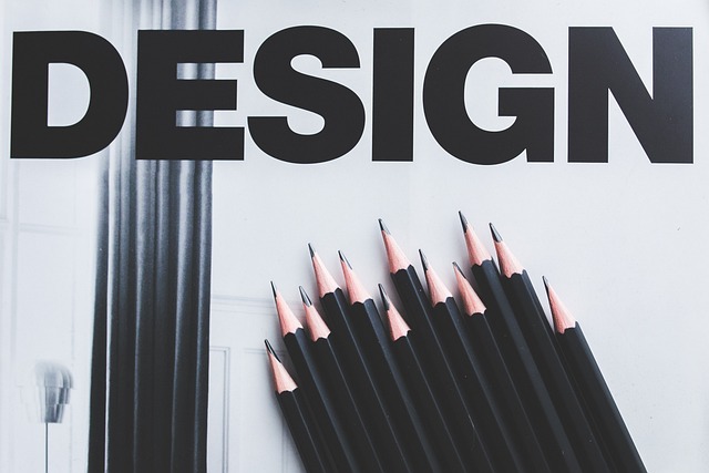
Visual Hierarchy: The Secret Sauce for User Engagement and SEO Success
Hey there, design enthusiasts! Ellen here, and today we’re diving into a topic that’s close…
-

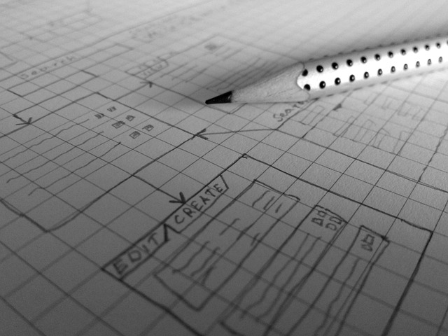
The Rule of Thirds: A Designer’s Secret Weapon
Hey there, design enthusiasts! Ellen here, coming at you with another deep dive into the…
-
Negative Space: The Powerful Pause in Design
Hey there, design aficionados! Ellen here, and today we’re diving into a topic that’s often…
-
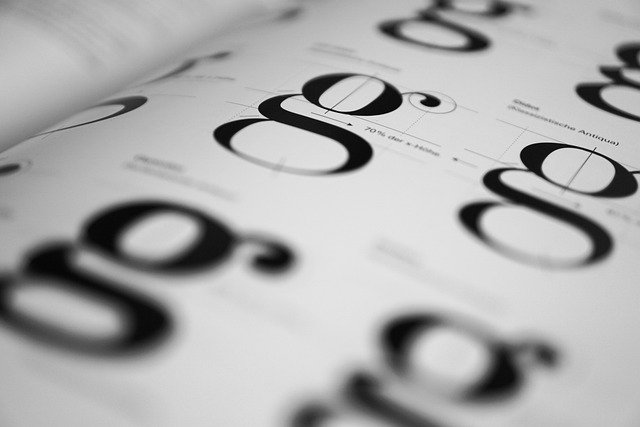
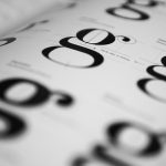
Typography 101: Giving Your Designs a Voice
Hey design fam! Ellen here, and today we’re diving into a topic that’s near and…
-
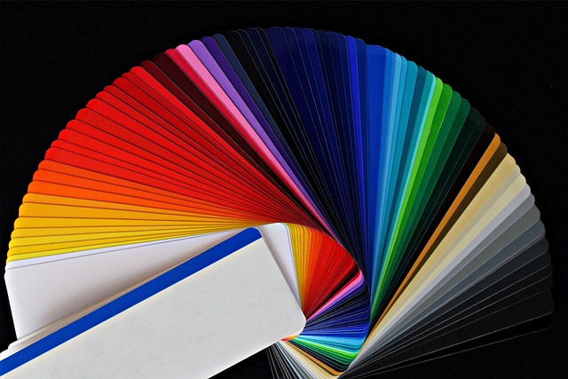
Color Theory: The Designer’s Palette Playground
Hey there, color enthusiasts! Ellen here, ready to paint your world with some color theory…
-

Ellens thoughts
Hi there! I’m so excited to finally launch my personal website and share my passion…
Latest Posts


Categories
Tags
There’s no content to show here yet.