Hey there, color enthusiasts! Ellen here, ready to paint your world with some color theory knowledge. Whether you’re a graphic designer, web developer, or just someone who wants to make their Instagram feed pop, understanding color theory is like having a superpower in the visual world. Let’s dive into some color basics and hacks that’ll boost your design efficiency in no time!
The Color Wheel: Your New Best Friend
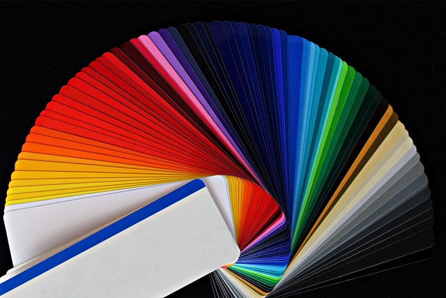
First things first – get cozy with the color wheel. This handy tool is the foundation of color theory. It shows the relationships between primary colors (red, blue, yellow), secondary colors (green, orange, purple), and everything in between. Understanding these relationships is key to creating harmonious color schemes quickly.
Quick Hack: Keep a color wheel nearby (physical or digital). It’s a lifesaver when you need to make quick color decisions.
Color Relationships: The Heart of Harmony
Now, let’s talk about color relationships. These are tried-and-true combinations that just work:
- Complementary: Colors opposite each other on the wheel (e.g., blue and orange)
- Analogous: Colors next to each other (e.g., blue, blue-green, green)
- Triadic: Three colors evenly spaced on the wheel
- Monochromatic: Different shades and tints of one color
Efficiency Hack: When in doubt, go for complementary or analogous color schemes. They’re foolproof and quick to implement.
The Psychology of Color: Emotions in Hues
Colors aren’t just pretty – they evoke emotions and associations. Here’s a quick rundown:
- Red: Energy, passion, urgency
- Blue: Trust, calm, stability
- Yellow: Optimism, clarity, warmth
- Green: Growth, harmony, nature
- Purple: Luxury, creativity, mystery
- Orange: Confidence, friendliness, courage
Efficiency Hack: Before starting a project, jot down the emotions you want to evoke. This will quickly narrow down your color choices.
Creating Effective Color Schemes
Now, let’s put it all together. Here are some steps to create effective color schemes efficiently:
- Start with Your Base Color: Choose a color that represents your main message or brand.
- Use the 60-30-10 Rule: In your design, use 60% of your dominant color, 30% of your secondary color, and 10% of an accent color.
- Consider Context: Think about where your design will be seen. What works on screen might not work in print.
- Test for Accessibility: Ensure there’s enough contrast, especially for text legibility.
Efficiency Hack: Create a color palette for each project and save it. This saves time and ensures consistency across your design.
Tools of the Trade: Color Efficiency Boosters
Let’s talk tools that’ll supercharge your color workflow:
- Adobe Color: Great for exploring color harmonies and creating palettes.
- Coolors.co: Generates color schemes with a simple spacebar tap.
- Color Hunt: Offers trending color palettes for quick inspiration.
- Paletton: Perfect for fine-tuning color combinations.
Efficiency Hack: Bookmark these tools. They’re lifesavers when you need quick color inspiration or validation.
Bringing It All Together: Real-World Application
Remember, color theory isn’t just about following rules – it’s about understanding principles and applying them creatively. Here are some quick applications:
- Branding: Use color psychology to reinforce brand personality.
- Web Design: Create clear visual hierarchies with strategic color use.
- Data Visualization: Use color to make complex information easily digestible.
- Product Design: Guide user attention and actions with purposeful color choices.
Final Efficiency Hack: Create a personal color library. Save colors and palettes you love – it’ll speed up your process in future projects.
Wrapping Up
Color theory might seem overwhelming at first, but with these basics and hacks, you’ll be creating stunning, effective color schemes in no time. Remember, the best way to master color is through practice and experimentation. So go forth, play with colors, and watch your designs come to life!
Until next time, keep your designs vibrant and your creativity colorful!